AMC: Bring Back The Magic
Going to the movies is magic. The smell of buttery popcorn, the lights dimming and that built-up excitement for escapism always take me back to being a kid. It's one of the few places where we can truly switch off, forget the scrolling and get completely lost in a story.
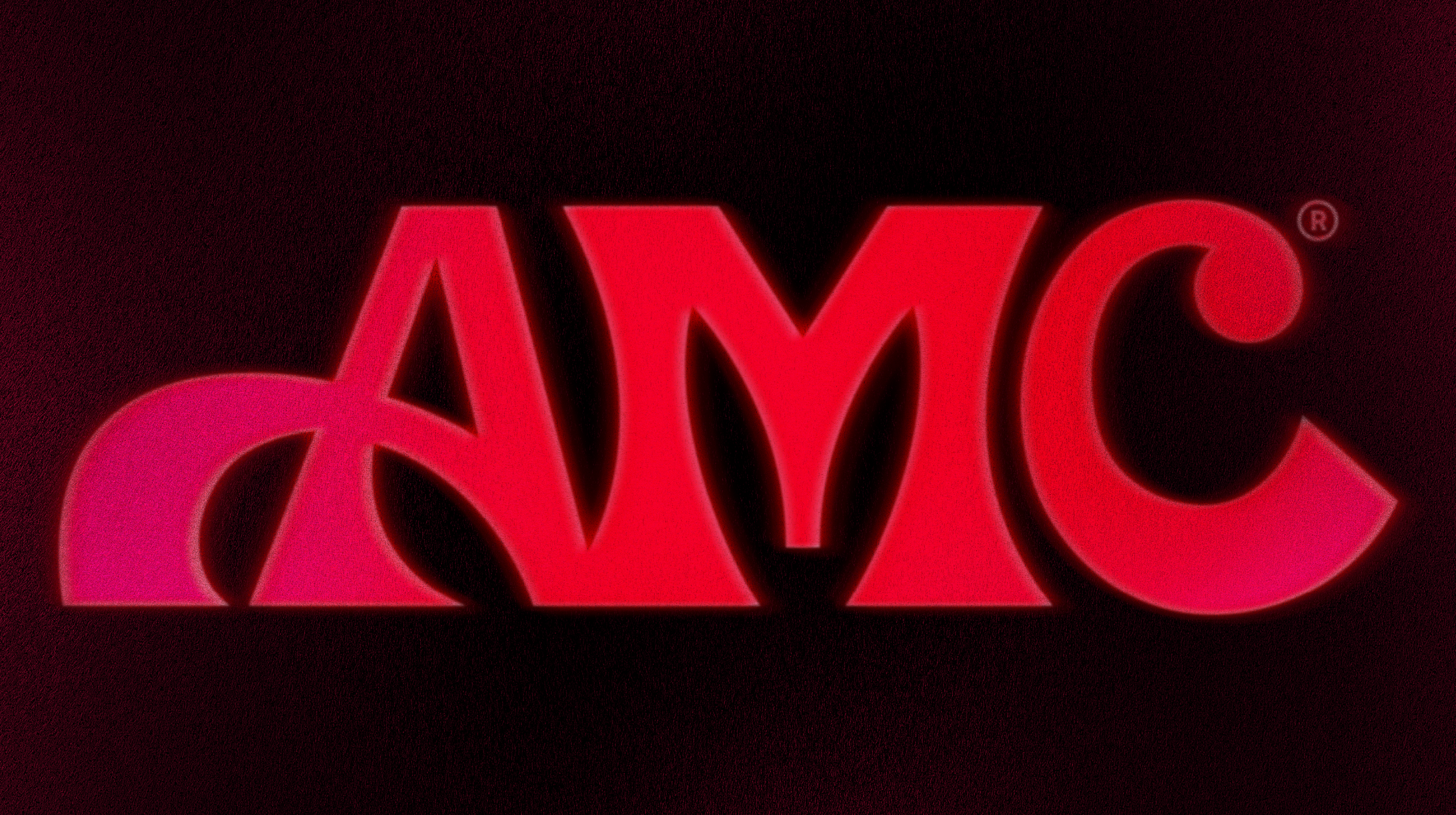
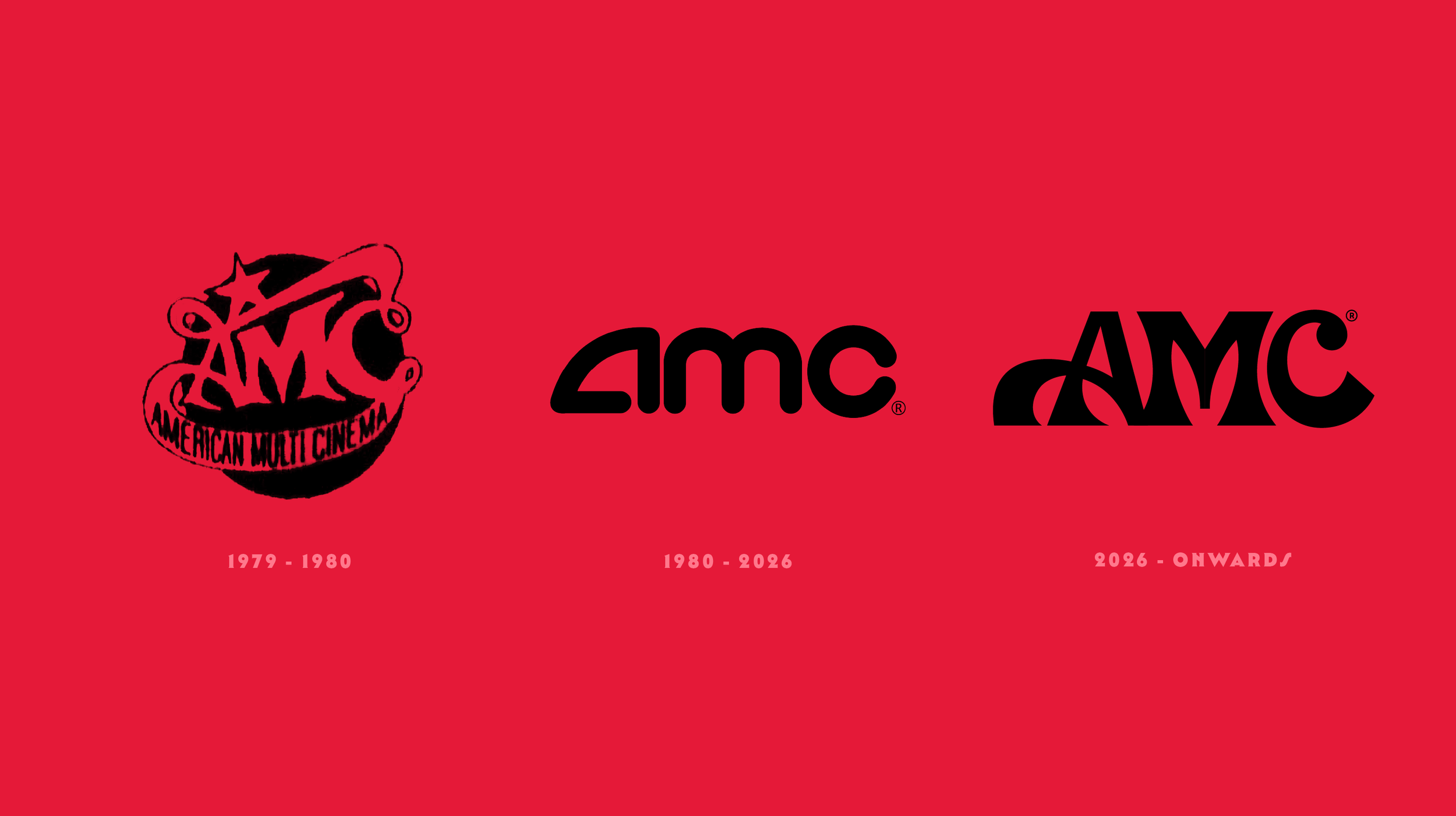
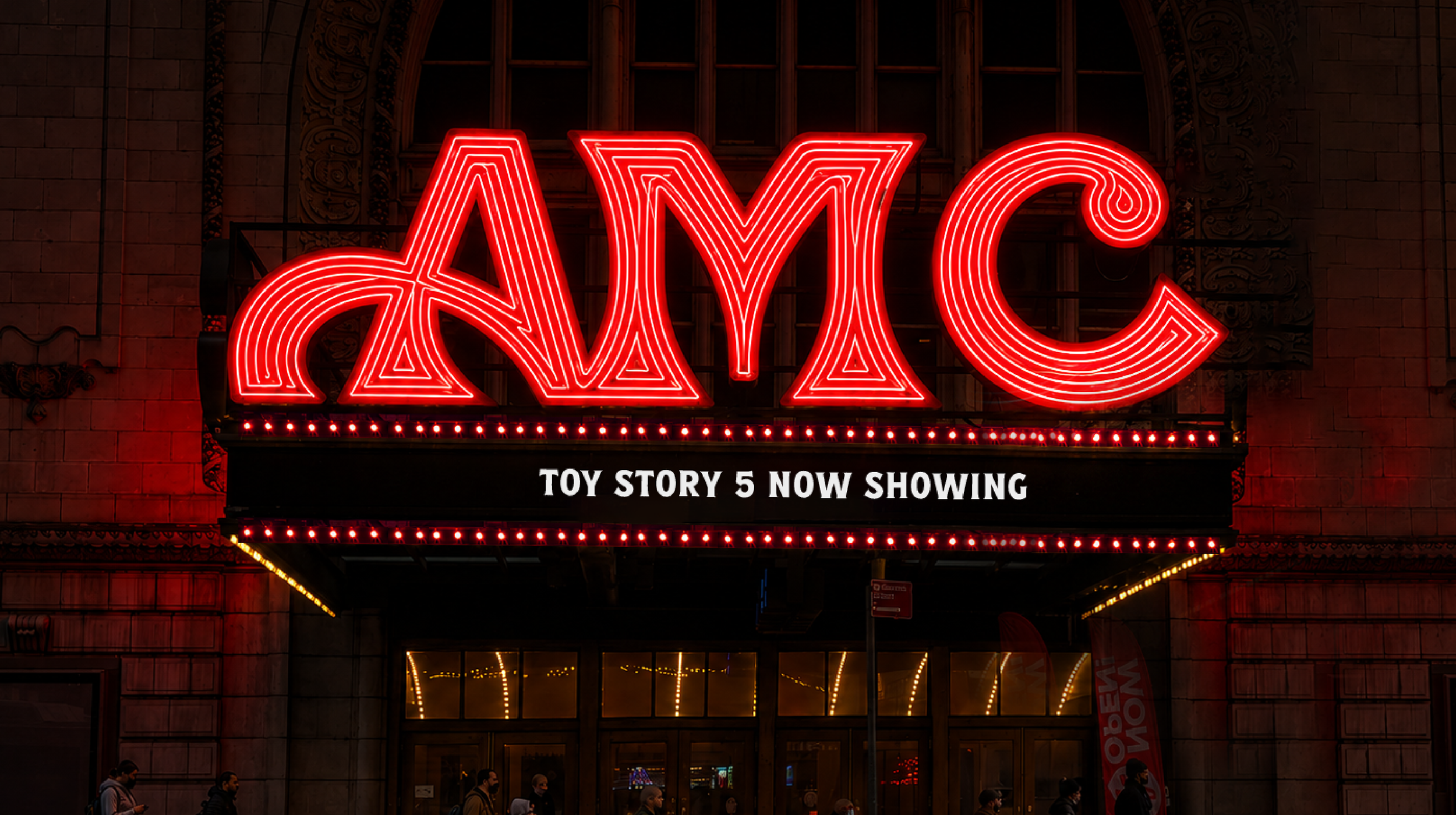
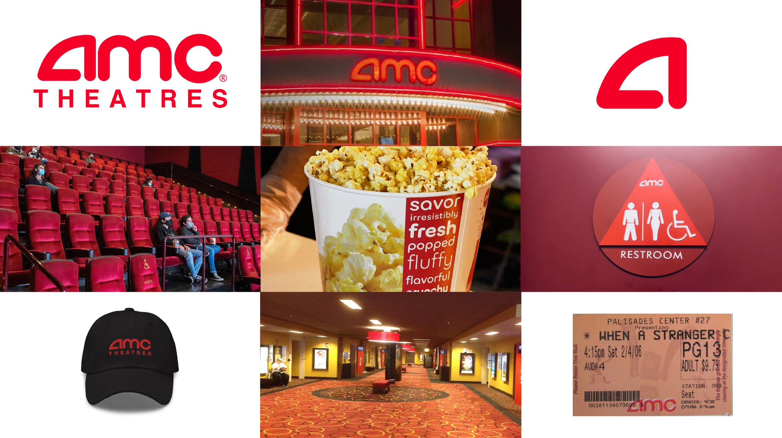
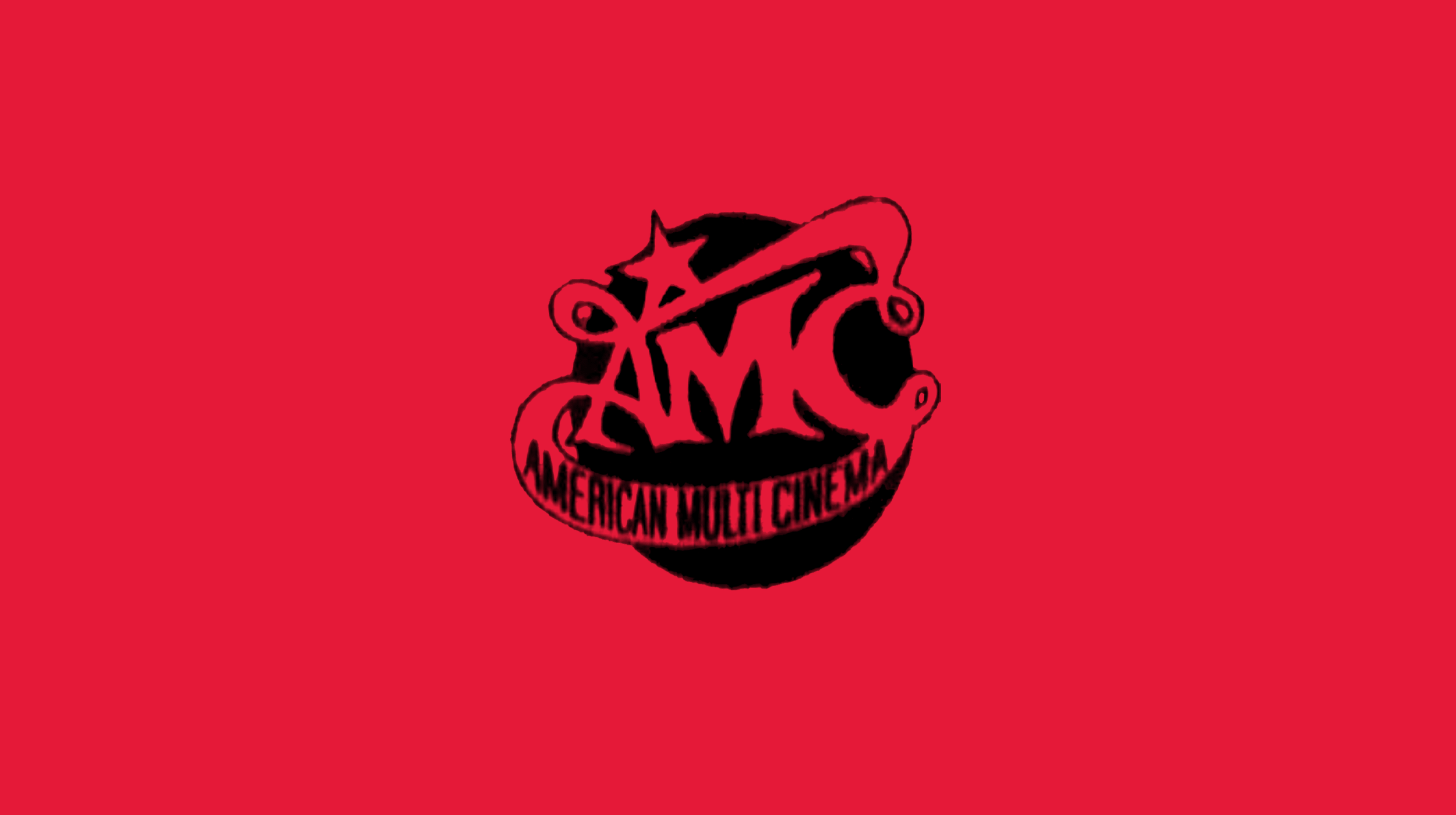
After moving to America, I spent a lot of time at AMC but felt the brand had lost some of that magic. Digging through its history, I stumbled across the 1979 logo and instantly fell in love with its optimism, eccentric curves and charm. It became the starting point for a complete reimagining of the brand.
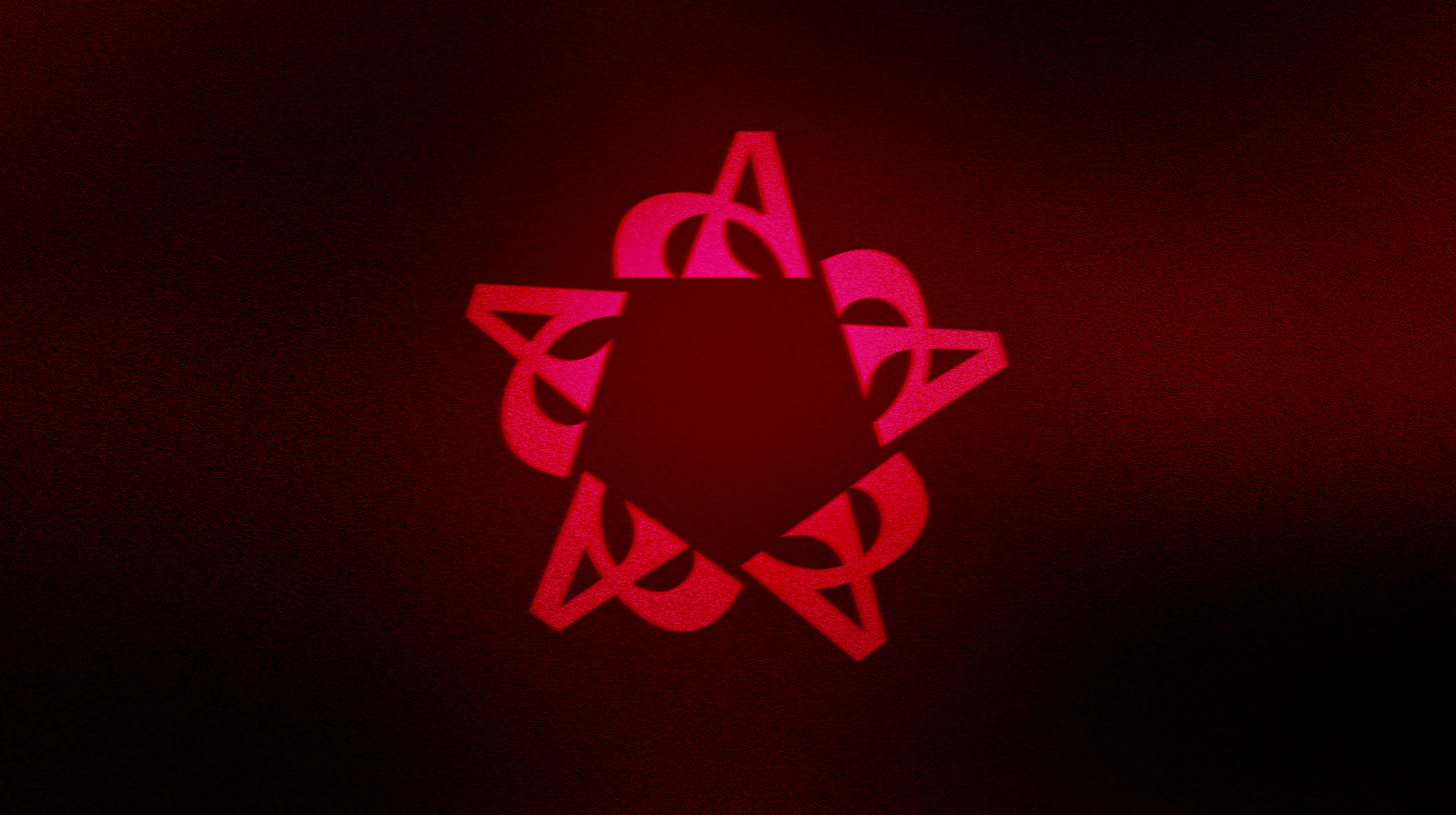
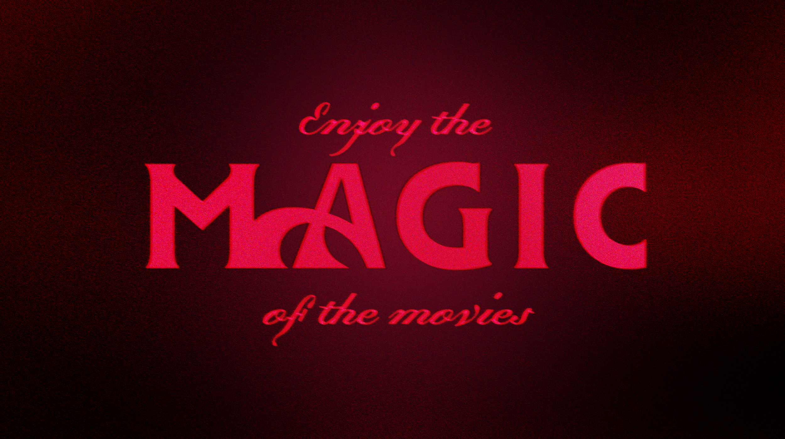
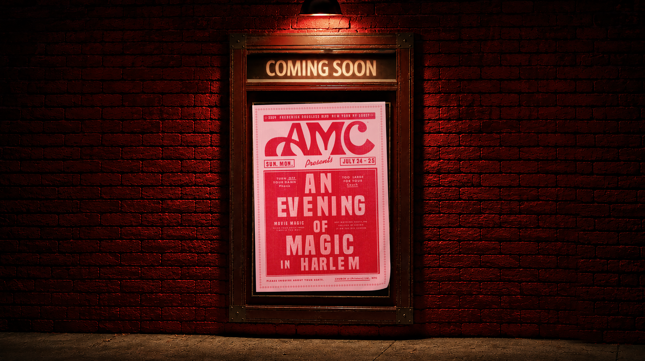
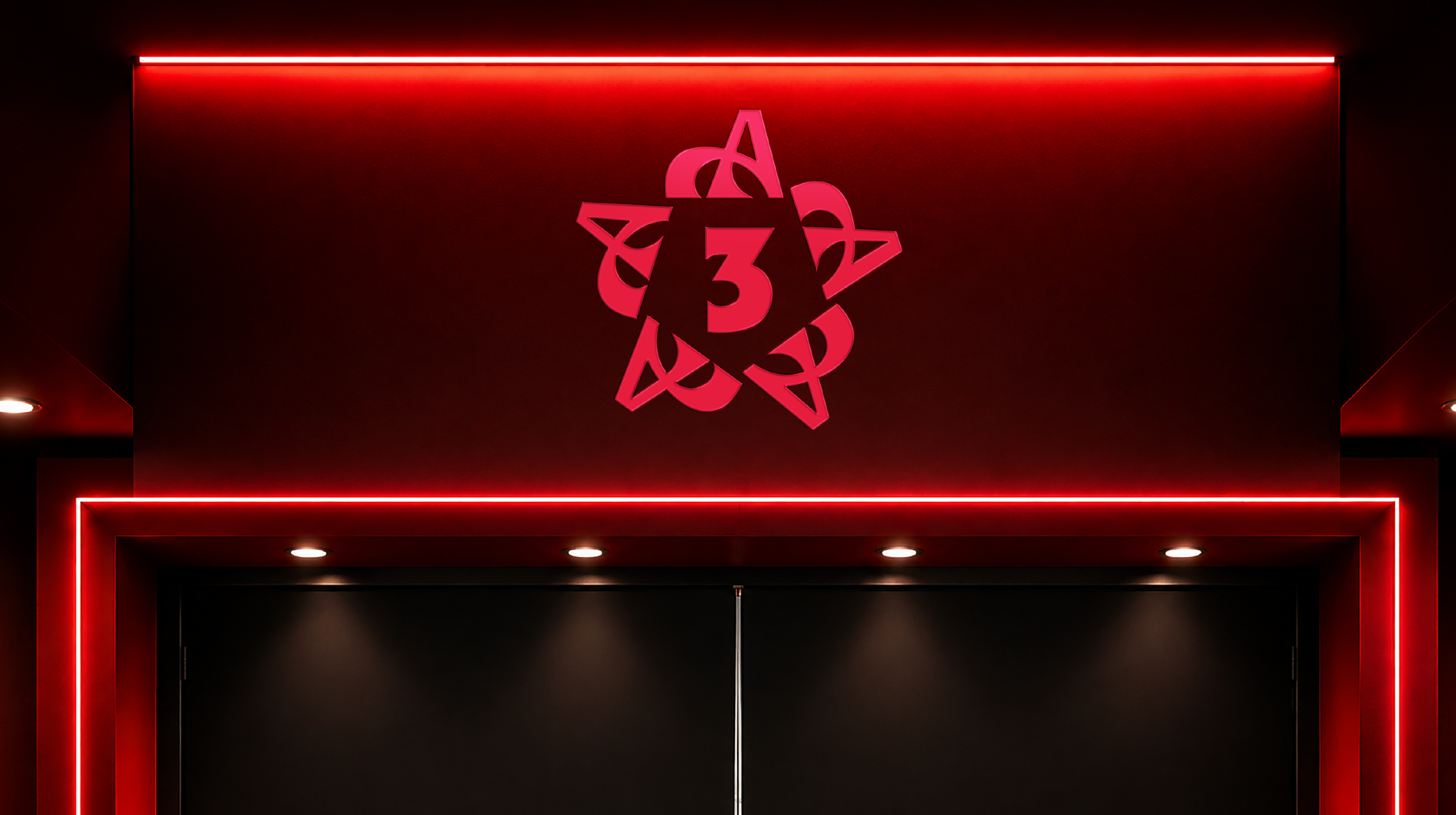
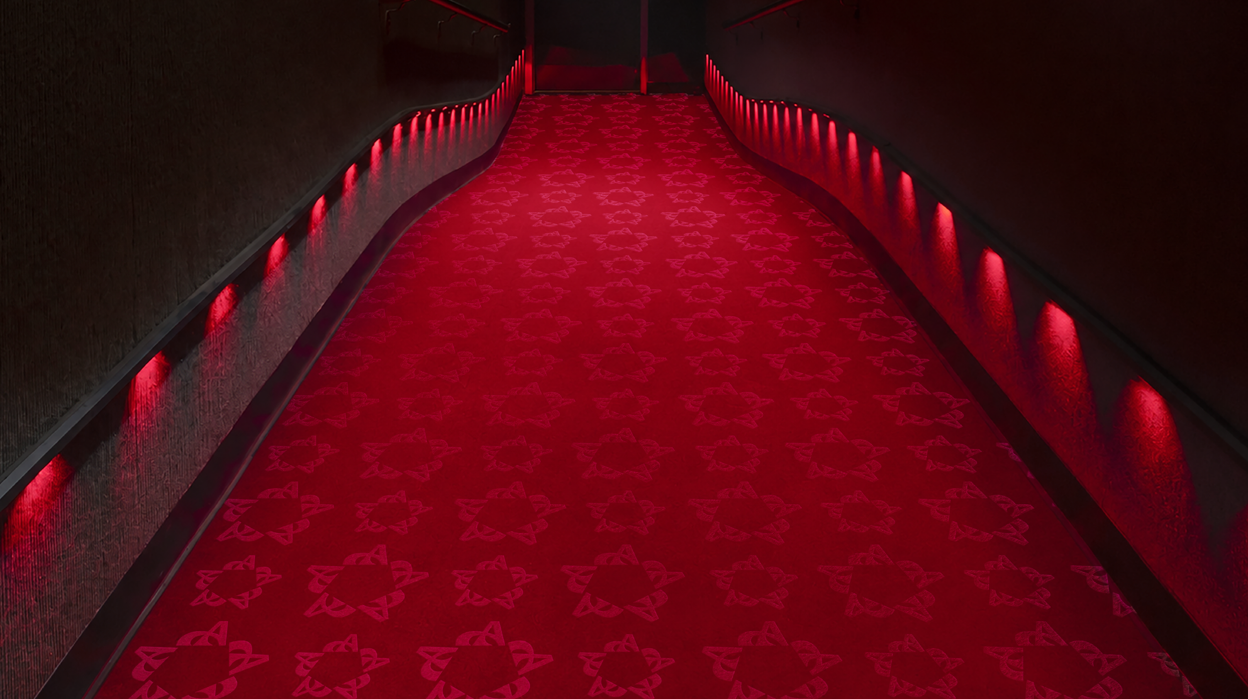
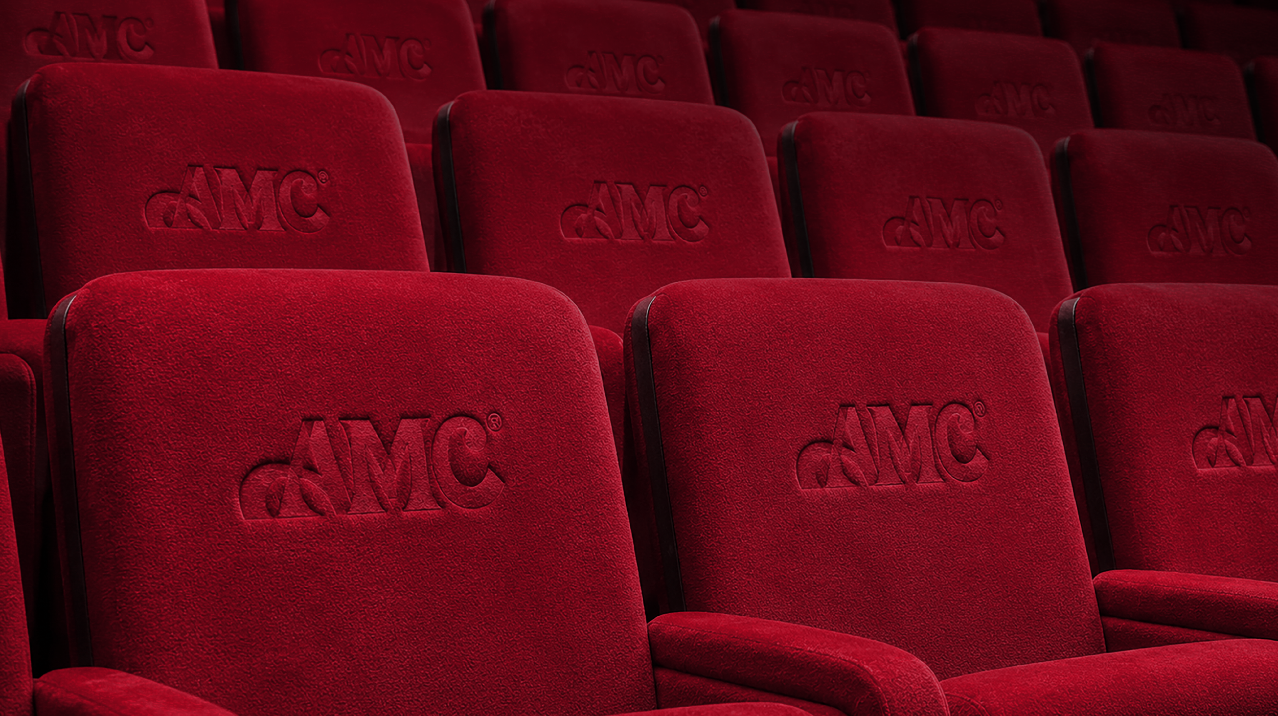
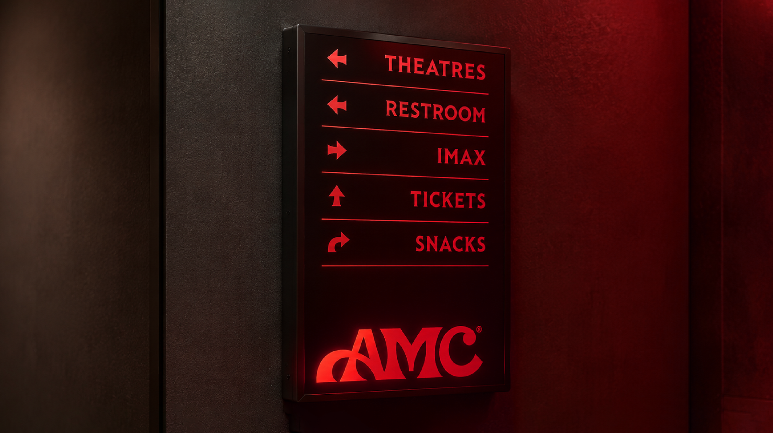
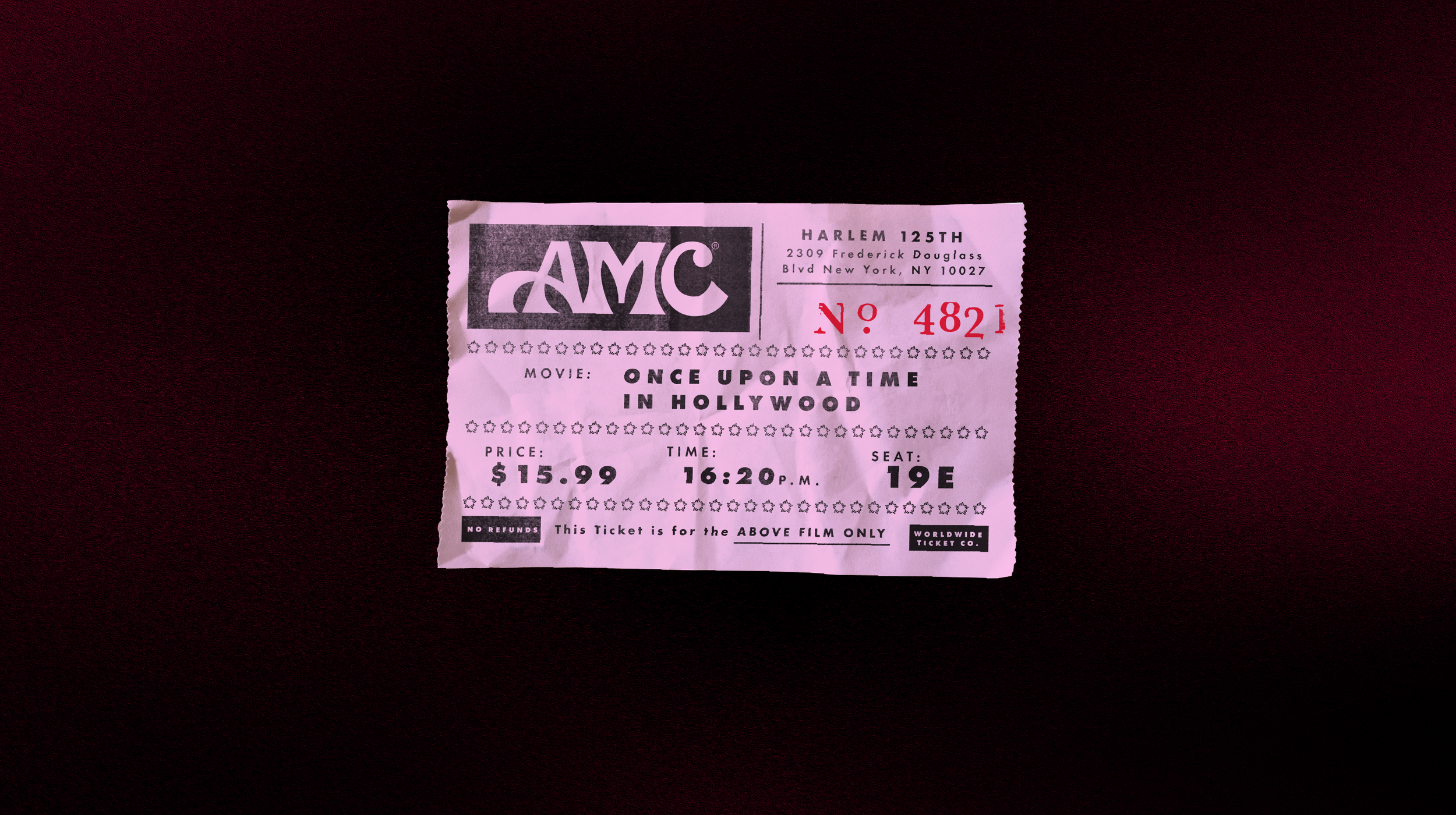
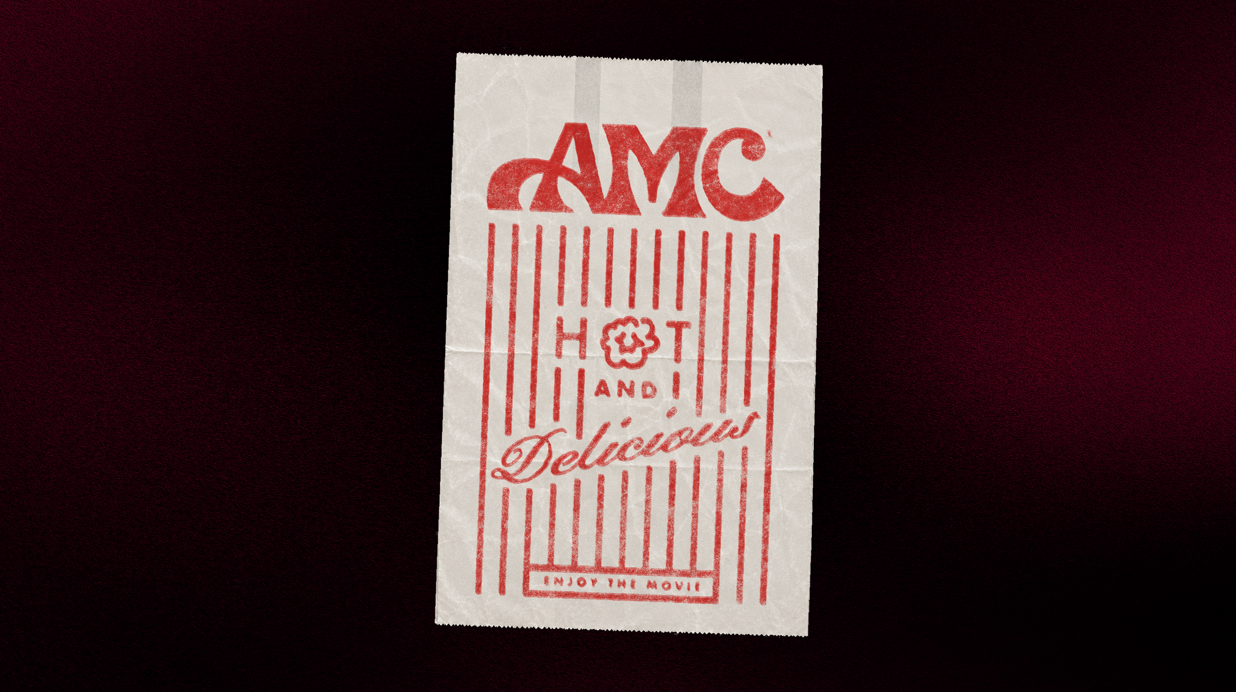
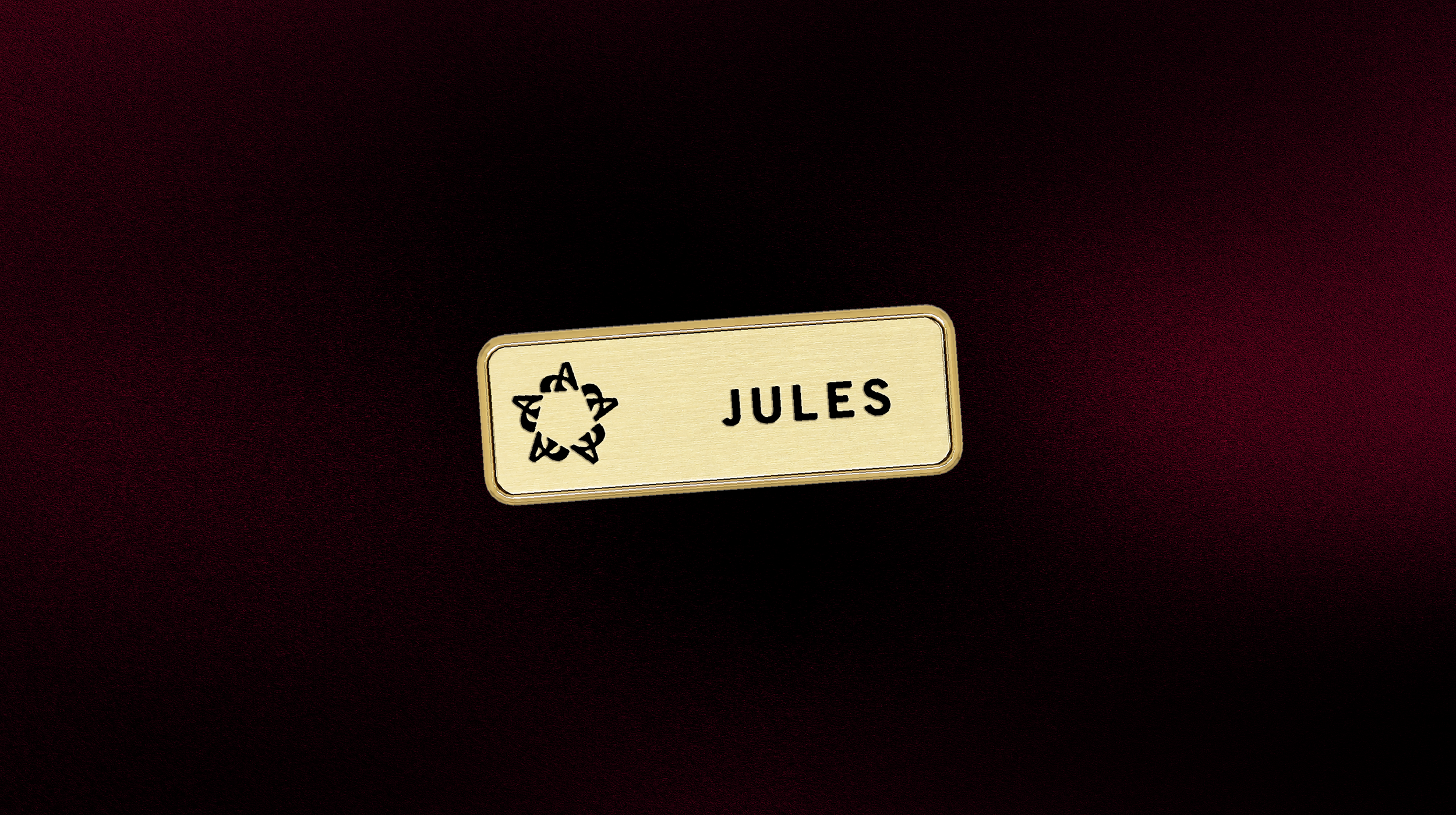
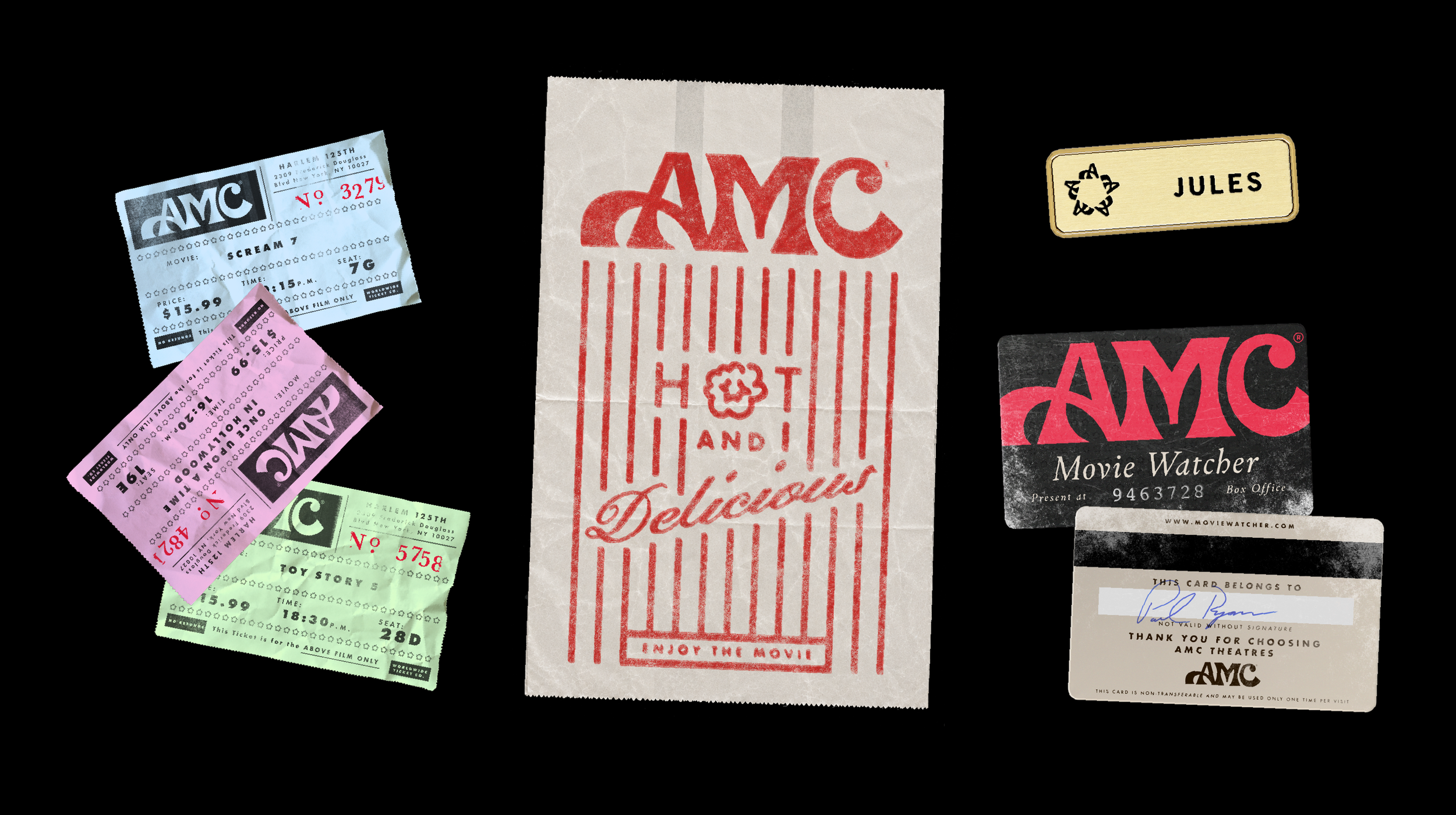
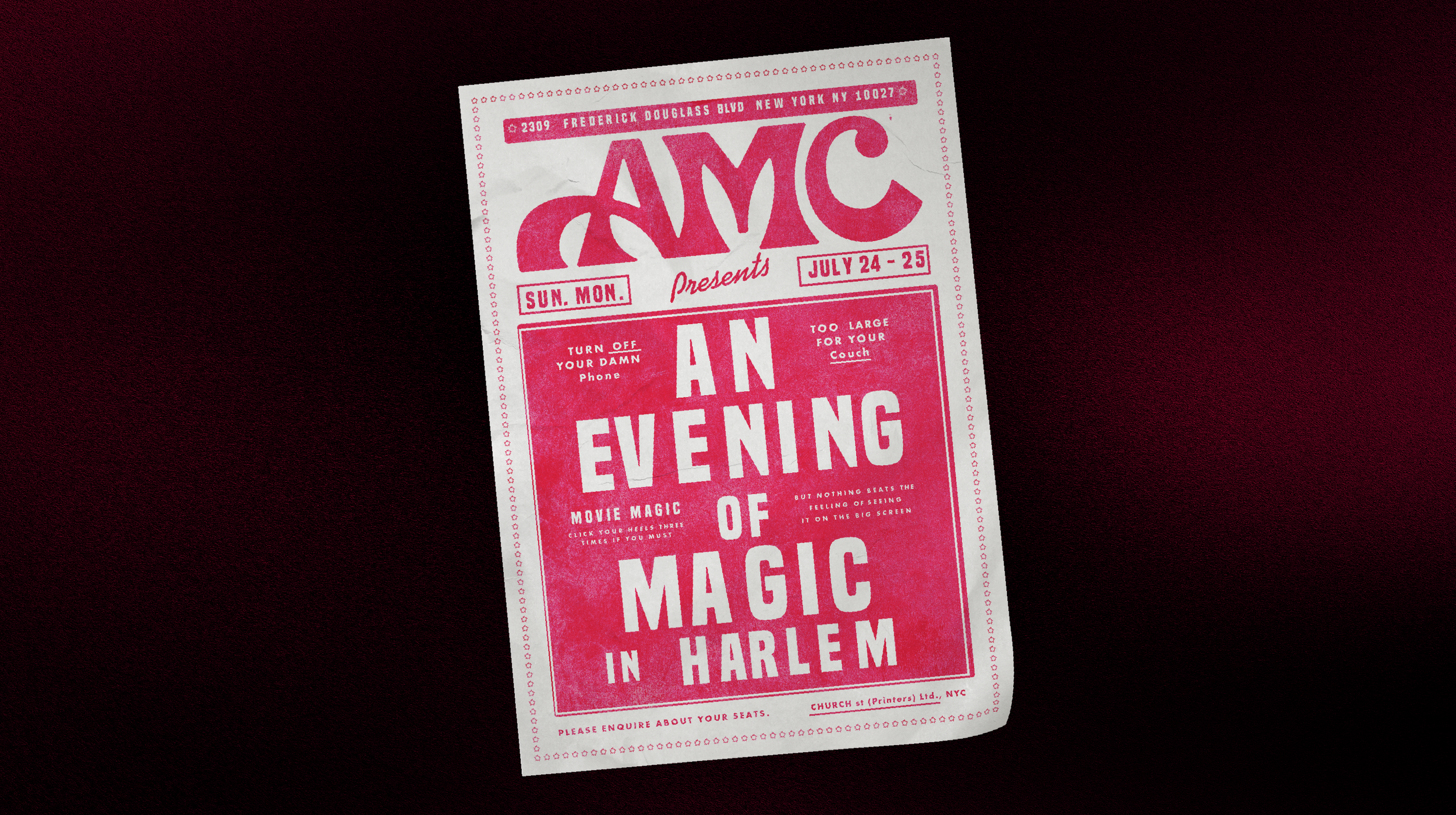
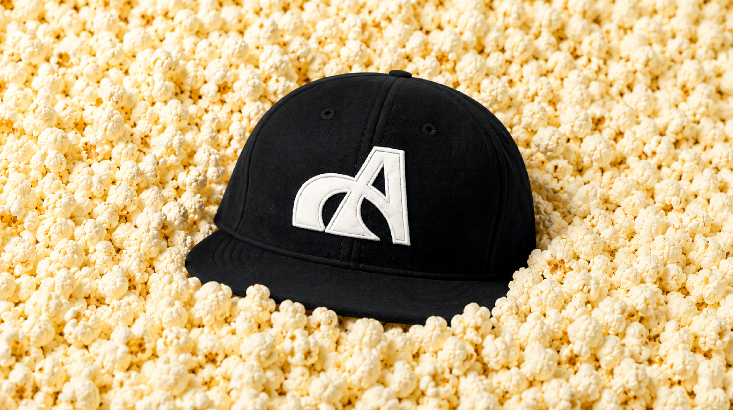
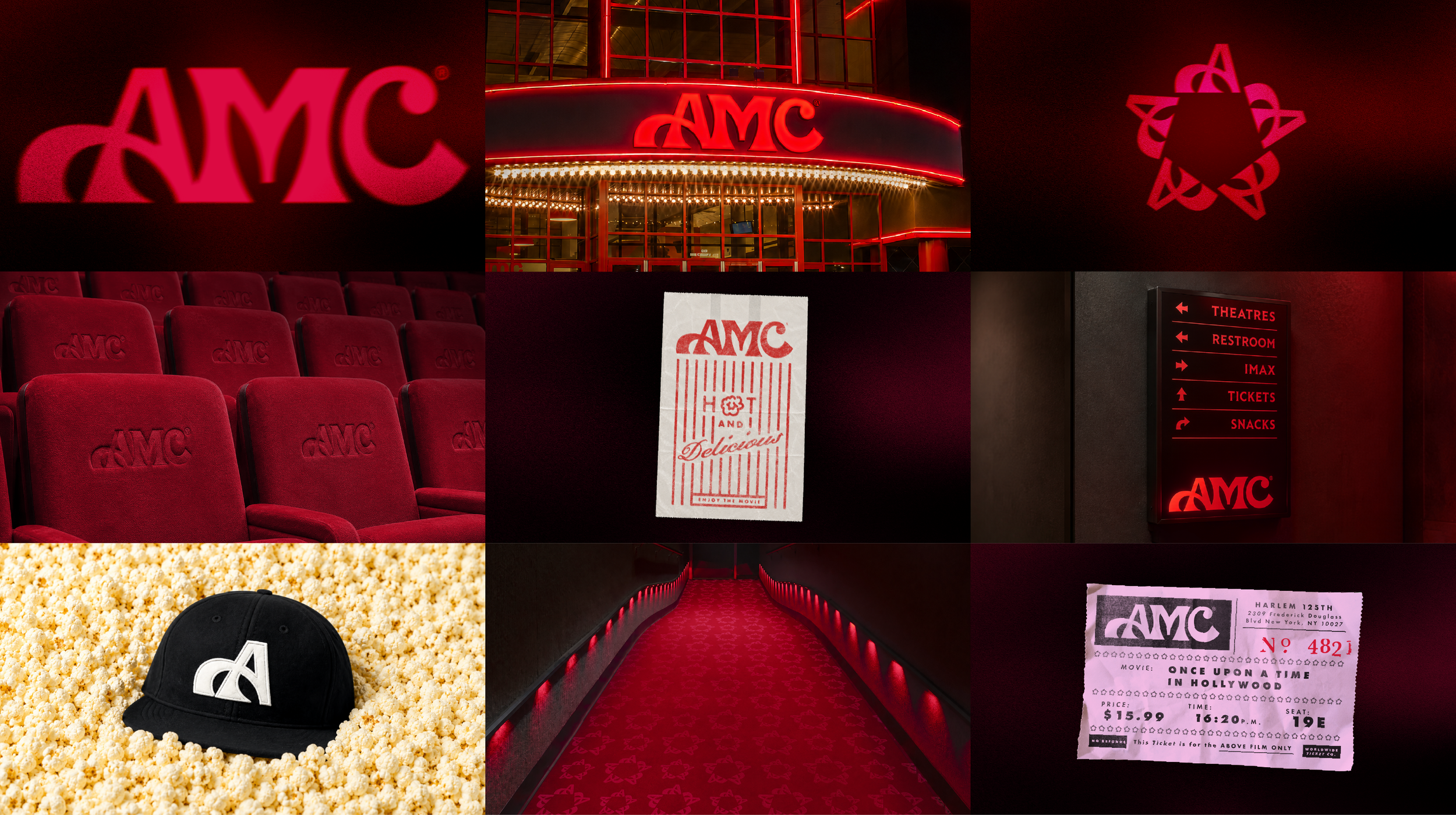
Rather than simply redesigning the logo, I wanted every touchpoint to feel like a movie prop. Inspired by cinematic ephemera, I created a custom wordmark, a monogram carried throughout the identity, nostalgic typography and a rich colour palette designed to make every cinema visit feel more immersive and memorable. The goal wasn't nostalgia for nostalgia's sake. It was to bring back a sense of wonder.
This project was heavily influenced by Annie Atkins and her approach to prop graphics. After taking her workshop in Dublin, I started seeing design through a completely different lens, finding inspiration in everyday typography, handmade signs and the beautifully imperfect details that make fictional worlds feel real.
This marks the beginning of a new chapter for me, combining over a decade of branding experience with a growing obsession for film, storytelling and prop design. And yes, my first standalone prop collection is inspired by Scarface. Say hello to my little friend.